Since I was first introduced to watercolors about 9 years ago, I have arranged my colors in a "rainbow" order from cool reds to warm blues or purples, followed by neutrals from light to dark. This order just made sense to me. Maybe being related to Sir Isaac Newton who studied prismatic colors influenced me?
But ever since studying Jane Blundell's excellent pigment information, I have been rethinking how I order my palettes. For limited or warm-and-cool palettes, I still go with the rainbow arrangement. But in palettes holding 20 colors, I'm now arranging them according to color and whether they are cool, warm, earthy or dark.This has been very helpful in quickly working in an all-cool or all-earthy color theme.
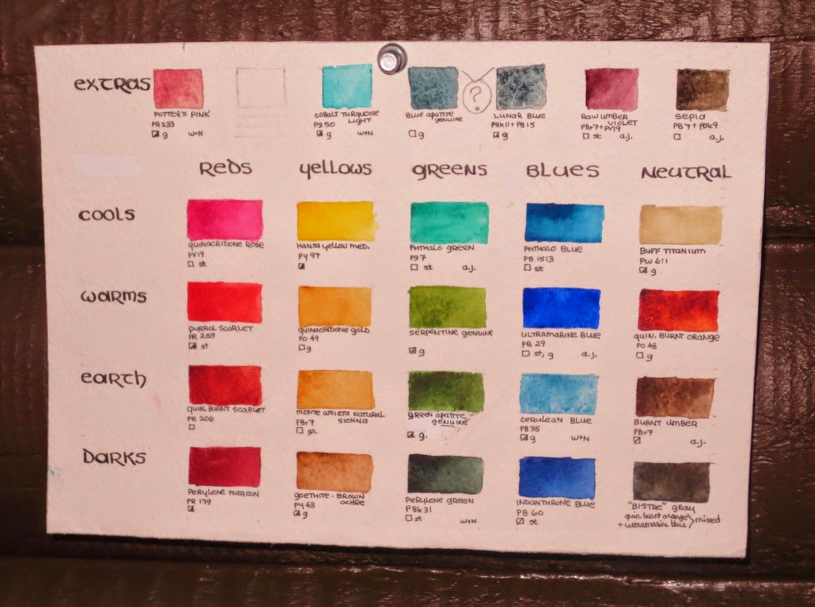
I keep the above chart pinned to the wall in my "studio" space (in the loft of our log cabin) to remind me of each pigment's properties. The colors in the top row are "extras" that I just happen to have --- Some I will definitely keep (love the potter's pink!") but I won't be replacing all of them when I run out of what's on hand. The blue apatite or lunar blue are very similar --- I'll probably keep the blue apatite, being a single pigment rather than a mix. That's the reason I finally gave up my favorite sap green from Daniel Smith, replacing it with green apatite genuine. Nearly the same color in a single pigment.
UPDATE: I'm getting rid of the sepia but adding Daniel Smith's permanent orange to the "extras" --- When mixed with phthalo blue, it makes amazing clean greens!

No comments:
Post a Comment